He is the man.
I am of course talking about the venerable George Grimshaw. Over the years he has gone from simply a name behind a popular old Boston freeware to one the biggest household names in the FS history. He is among those who not only pioneered the art of FS scenery design, he is also among those who pioneered the art of making high quality sceneries with little to no FPS negative impact.
Now in comparing the P3D CYUL to that of FS9, a very major note is the 2 sceneries are damn near identical abait the features only P3D and FSX are capable of. Thus, needless to say, the FS9 crowd should be extremely pleased with the CYUL created for their platform.
Now it is very important to note that the FS9 CYUL is NOT a dumbed down FSX version. As I just mentioned, the only thing it lacks are FSX features FS9 can't do. With that said, you will find that it is all FS9 folks would expect and included both road and rampside vechicle traffic and volumertic grass.
Now it's very obvious that the textures you will find in FSX and P3D will be greater and sharper, don't allow yourself to think that the FS9 textures are not sharp. You will find that the FS9 textures are quite sharp indeed and represent the airport very well. You will not be disappointed.
One of things that make this FS9 version so good to me is the fact that it comes with no worries. What do I mean by that? Well recently I dropped $1,000 in upgrades to better my P3D experience. The result? Somedays I will see frames in the 50's. Not smooth frames mind you, but stuttering frames. Other days, I can't get from Orcas Island to Darrington in a simple Cessna without a OOM. But some days, everything will go perfectly well.
With FS9 though, there are just no worries because no matter how much I use it, it will deliver desired results 99.8 percent of the time. That's what i call no worries. And with each FS9 release, I am so grateful because I know my smooth FS9 experiences will continue to be renewed with each new product.
With Montreal, this is a huge deal because it's a wonderful airport. The location is wonderful also because there are several high quality payware airports just an hour and half away.
Just looking at these shots many might say FSX looks better. But look at this work. Do we really need it to look better? In my opinion, no we don't. Because it looks almost identical to it's FSX counterpart. Those are the joys of FlyTampa. The boys can make it look good, run damn good, and in turn, make us feel really damn good.
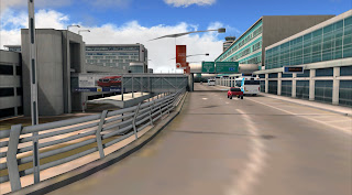
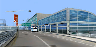
In the front of the terminal, no details were left out. Both moving and static vehicles are clearly present making the airport look alive.
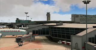
With my full AI in effect, the ramp side is teaming with aircraft.
If it's one thing George knows how to do, it's make perfect objects based on data he can get his hands on without getting anywhere near the airport. Everything is accurate and looks great.
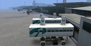
Here we have a couple gates waiting for their flights. The hotel looks great!Developers, I can not stress this enough. Parking lots with 3D cars are the norm now. They are what we expect these days. Here, we get a very accurate feel that there are people here... even though we never actually see them...
Now everyone who is used to my reviews know how a big deal fences are in my world. Here, I have no complaints!
Great looking airfield. I love this product!
In this shot, you get a good example of the differences between FS9 and FSX/P3D and that's the windows. Now my P3D review is below and you will clearly see there is a big difference,
Here is where things get a bit Jazzy... I don't think I have ever had an issue with FlyTampa's Afcads. Things go where things are supposed to go.
Here, the building textures look damn good to me. This does not look like the work of a developer feeling "...well the FSX is complete, let me throw together some FS9 version so they keep their mouths shut..." no. George may feel that way, and if he does, it is not evident in his work. Not at all. The texture work here seems to say "...yeah, I still care about you FS9 people. You still count..." again, he may not feel that way, but that is what the quality seems to communicate.
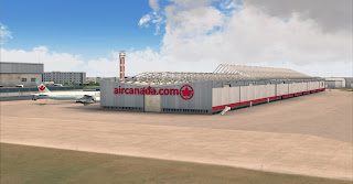
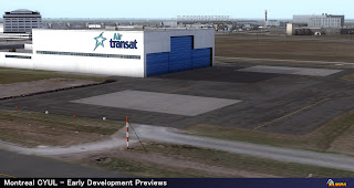
Moving away from the main terminal, we get a look at the cargo, GA, and hangar areas. All in their right places and represented just as they should.
This is clearly the work of a developer with skill.
Here you can clearly see just how after so many years, FS9 still looks damn good and so does Montreal. Thank you George for giving us FS9 people something new to be excited about. And something done with passion. Few developers still have passion for the old girl, here, pride in ones work is very much evident.
And with that said, let's look at some some screens from Lockheed Martin's Prepar3D.
Now, this project took a lot longer than it should have and many wondered why. So in case you missed it, I added a conversation we had with George covering the reasons and constraints leading to the massive delays of this product. You may also recall a while back an article published by Dominique regarding some issues a few major developers ware experiencing with the P3D platform and 3DS Max. These issues were causing major delays in scenery developments. We did get to hear from Umberto of FSDT on some of these issues a while back.
NOTE: This conversation was published back in August of 2012:
D'Andre: Good morning Greorge. This P3D issue and the delays it's causing Montreal. Have you been able to make much progress?
George: The P3D issue is still frustrating. As scenery developers, we are constantly trying to improve on our previous scenery & with Montreal one of our improvements has been a terminal texture size increase from 1024 to 2048. The reason for these larger textures is mainly to maintain a decent resolution while allowing unique texturing, shadowing & ambient occlusion baking rather than the usual tiled textures where the same image is repeated along the length of the terminal. Unfortunately the latest version of 3d Studio Max that was supported by Microsoft/ACES, was version 9 released in 2006. Max 9 is now very slow & cannot handle large textures. It is limited to a low amount of memory because of FSX's 32bit exporter plugins. Once this memory limit is hit, Max will crash & sometimes corrupt your files as a bonus annoyance.
Autodesk, the makers of 3d Studio Max, rightly decided to overhaul the poor viewport performance creating a new system they called 'Nitrous'. The difference was enormous, Yugo V McLaren F1 sorta difference.Max 2012 can throw around an entire Airport scene at 30 fps compared to 0.5 Fps on Max 9. The crashing & corrupting of files is also addressed.
Plus Max 2012 comes with 100s of modeling & UVW mapping improvements that have the potential to shave 100s of hours off development times. When P3D came out, it came with an updated SDK which supported Max 2012. This was very exciting. However, it was disappointing to discover the P3D Max2012 plugins would crash when trying to export more complex models due to a memory leak.
Even Microsoft FLIGHT's SDK supported Max2012 reliably way back before FLIGHT was released. Not that it matters now.
D'Andre: Do you think Lochheed Martin should make more of a effort and look into these issues?
George: I understand that P3D/LM don't owe us anything. It's unfair to expect them to fix it. But they are our only hope for a faster, more reliable & feature packed 3d Modelling package.
I don't want to sound like I'm knocking P3D, I really would love for it to eventually replace both FSX & FS9.
_________________________________
As you can all see, most of the issues with P3D have been either resolved, or work around methods have been implemented in an effort to get things done. The next major version of P3D will be a completely new build and will require a new license for current owners like myself. So there is much hope for the platform.
So yes like I said, I made some upgrades recently and these below shots show how the upgrades paid off. You can check our system specs page for my system info. I can say that the QW Avro ( the biggest aircraft I have in P3D) got me 22-35 FPS average with my settings which are mostly high. The screenshots give you an idea of where my settings are.
Now yes the FS9 textures looked damn good, but here we got a totally different ballgame going. Still looking very similar, bit those windows are no joke!
I have no AI in P3D sorry. But I like these shots without the AI. It almost seems to say, this place is brand new, it's start of the art, and it's ready for action!
Now only are those window textures and reflections cool, but they also show you there is life behind the glass and that's because the terminal object is a bit hollow so you see the reflection but also through the glass. Very nice feature but who are we kidding? There is no glass.
Again, these shots just seem to say, FlyTampa created me and I am ready baby!You can really see some of the window reflections here. Very nice work.
I rode on some bus like this in Paris. The first time I saw one I thought it was so funny looking. I wish these were animated, but I am glad to see they are here at all. They serve as a reminder of where you are.
Another shot of the window textures.
Very realistic jetbridge textures and ground work. Crisp!
Here we have the iconic tower. Is it me or does this place remind me of Orly somehow?
The windows the glass, just prefect and real. We just don't see architecture like this anymore.
Another look at the textures and reflective windows.
This just looks so real! I can honestly say that flight simulation has come a very long way.
Just look as all that glass! The textures, very realistic.
Look, he even made a point to show off his attention to detail by adding the handicapped parking zone. Many developers might not have bothered. It is now an industry standard to model these parts of the airport in high quality.
I spent the whole day combing this airport and finally I can see the sun has set. This is my favorite part as this is when all the lights come on! Look at that building logo. Is this real? or a simulation of something that exists in real life?
Still floating around look at that light splash on the ground. My boy is good!
More lights. Just look at all the work that went into this above shot. That is skill. And the hard work shows.
I just love those textures and lighting splashing on the buildings from overhead onto the building. Also note the greenish light on the ground from the inside.
Now this is night lighting done right. A very realistic feel! It all just looks so real!
And looking at the terminal, man has guy who created Boston V.1 come a very long way. We never think of FlyTampa improving because they have always been so good. But yes, like all developers with a passion in their craft, the FT boys are constantly getting better at what they do. Because they always deliver on our expectations we never think about it.
The above shot says it all and sums up the night lights and what you can expect. This is a work of art.
Moving to winter, nothing much to say. It's winter and looks as winter should.
I almost forgot to add my favorite part of the project! Who are those handsome beta testers??
So, FlyTampa has done it again. More to the point, George and Martin have done it again. This is an unstoppable duo. Here we have a product that everyone can be happy with. FS9ners and FSXers alike. It is an airport many have been begging for. They answered the call.
Canada has been overlooked for far too long. But finally, Canada is getting the attention it has long deserved. And stepping out of the shadow of it's Southern neighbor. With Vancouver, Montreal, soon to be Toronto, everyone is pleased that the legacy developers are getting it covered.
As far as sales go, everyone has also proven that Canada is worth the effort given the fact that many developers passed it by with the thought that there are not enough Canadians in the market. Well consider this, Canada makes up the top 5 in the AirDailyX readership and there are 2 Canadian members of AirDailyX. So will we see the rest of Canada covered? You damn bet your ass we will! And if the quality of Montreal is any proof of what's in store for us, it's going to be a wild ride and we will be here as always to cover every inch!
Canada, we are ready!
Thanks for reading!
D'Andre
FSX REVIEW BY DOM MASON
FS9/FSX/P3D. Dorval airport... Rings a bell ? Dorval became Trudeau, from the name of Canada first minister P.E. Trudeau. if i remember. The third canadian airport has never ceased to be reconstructed, modernized, updated. A seventy years old lady that is serving a vibrant city.
FLY TAMPA MONTREAL TRUDEAU CYUL
REVIEW
Reviewers : Dom Mason
Version tested : FSX V.1.0.
File size : 850 MB
Installation : Very easy.
Manual : Yes, 14 pages, airport layer chart.
Utility : No but during installation, several options/features can be selected.
Framerate : Excellent.
PMDG NGX : >16-20 FPS on take-off (runway 26 R) on a mid-core processor.
Windows Seven 64 bits. FSX sliders at 100 % (no AI traffic). (no UTX Canada).
Test configuration ;
Processor I5 / 3,54 GHz / 6 MBram / ATI HD6570 1MB / Windows Seven 64 bits / FSX SP2.
The bad :
* A very large area has been designed around the airport with a lot of custom buildings. It' a "plus" but can slow down some processors...
The good :
* The impressive amount of technics applied in one project ; self shadowing, ambient occlusion, custom reflection maps (FSX), new wet/puddle effect in rain, low cloud/mist effect (FSX), floodlight lamp glows, 3D tunnels, new realistic snow effects, especially along runways and taxiways.... etc.
* The high quality and diversity of textures (i imagine the time spent to process hundreds of textures).
* The choice of Montreal airport. And all possible destinations to Canada, USA, Europe...
* The good framerate.
* Highly competitive price compared with many heavy airports of this level of quality.
( Taken with low graphic card settings )
The history of Montreal CYUL
Passengers from all around the world, coming to the Olympic Games (1976), supporting the tremendous development of this country, with french speaking peoples from France, Caribbeans, Africa, etc. George has perfectly caught this place. It's not a brand new platform since the construction started after 1940, so the developer from F.T. has spend a lot of time on textures, designing all these buildings constructed during the fifties / sixties.
Montreal is a wonderful city. I came back there 3 years ago, guys playing baseball, the underground life, squirrels of the Mont-Royal, and most of all, the Canadians Montreal, Ken Dryden, Beliveau, Cournoyer... (oups sorry, these hockey-men are from the past already.. But still in our heart).
Land in Montreal.. You won't want to leave it... or leave it and come back just to enjoy this marvelous work by Fly Tampa.
According to your computer performances, you can select some of these features : Volumetric grass, static vehicules, etc.
In Fly Montreal, George has programmed many ambient occlusions, a feature included on 3DSMAX and that enhanced 3D models by including fake but natural and realistic shadows. The addition of this effect, snow traces and realistic rusty and old-looking textures, really enhance the scenery.
* * * * *
T.. like Textures
Just take a look at this screenshot. We are somewhere in the center of the airport, near the large cargo area. Look at these textures on the borne and in front of this fire station. Look at these wear traces on the edge of the borne.. Realistic ! And hundreds of 3D models have been designed this way.
The south part of the cargo area (Air Canada hangars). From Google Earth on the left, and Fly Tampa Montreal on the right...
I really like the contrast here between colors, between the exhaust nozzle and the hangar. In winter, many buildings are surrounded by some snow textures on the ground. The large cargo area in the center of the airport, also includes a few static aircrafts.
These hangars, located between the two main runways, have many fine rusy traces, on front buildings, on doors, on the roof etc. Some snow traces along the ground marks but i am not shure if this is realistic ?
This large cargo area has many details : static cars, street lamps, poles, signs, pallets etc.
Along the international terminal, glazed, crispy window textures. And this one hasn't even been taken with best quality settings on my graphic card. One regret though, here. I really miss the shadows effects simulating the passengers walking in the lobby. I think Martin invented it for Chicago Midway airport. It's genius. I really wish we will be able to see - in a near futur - the life inside terminals. From the cockpit, it would be wonderful. Many editors tried things to show the inside view but it's still not convincing. FSDT in Vancouver did a great job on it though. I like the way these windows are designed too, just showing a few details of the inside halls.
Fantastic work on the tower. On the top of it, several antennas, an aluminium ring, air vents, with ambiant occlusions. There are also reflective and transparents textures...!
This is the main terminal building of the airport. Here again, George has given this very good old-looking display. You can see the work on the textures and the ladders. There are also traces of rust from the roof.
* * * * *
S.. like Snow
George has developed an entire new way to display snow on airport. In fact, Montreal includes many different kind of snow traces, of different density and aspect. Now, i think we are just at the beginning of what we can do on this. It's really apparently to design "volumetric snow". A-Flight did it in their Helsinki (picture below) but it's too artificial. If you look at real pictures of airports and runways under snow, there are volumes, snow balls, peaks.
In winter, this snow layer is everywhere, invade the buildings, taxiways and aprons, with different textures and levels of opacity. Here there is some halo effect on this parking.
Three developers, three ways to design snow along runway... Make your choice ! Personaly, i like the way the snow is encroaching on the runway. But curiously, i did not see any snowplough ! I remember Limesim (Normann) had included an animated one in Antarctica X.
* * * * *
R... like Runway
Just look at these puddles ! That's new ?! And you will find some on aprons and along the runway when it's raining or snowing. Don't worry, absolutely no effect on your framerate.
Runways will impress you. You will discover many variations of shades (grey, blue, ./..) and effects. These textures enhance considerably the visual impression of speed during rotations.
T... like Technics
Dozens of bridges, gateways, a tunnel, multi-levels. Here the picture shows the tunnel near the Côte-Vertu, near the threshold of the runway 24 L. Animated traffic included !
(Textures in summer)
An incredible tangle of lanes and motorways. All the real hotels around the airport are included.
The quality of ground textures at gates, aprons, runways is simply magnificent and shows all the microscopic details of concrete. An old-looking concrete, actually.
N... like Night
The vinicity of the airport has been designed too : custom buildings and textures, traffic, very effective night lights (here).
Here at night, all the light poles are enlighting terminal and gates. The different greens and greys colors are realistic.
Conclusion :
I am looking hard at reporting some weaknesses. I can't. The framerate is really optimized, many effects are included (reflective textures, snow, night light, effective light poles at night, tunnels...) and large area covered around the aiport (100 sq.km) enhanced the city of Montreal. Even the price is fair (less than 27 euros / 37 dollars), considering the work. George has spent more than a year on this unique project. Should i inveil these informations ? During this year, the developer had to deal with several heavy challenges : new construction plans in the real airport, problems of memory and conversion files with P3D etc, etc. I make a guess. You will still use this airport in 5 years !
Thanks !
DMason
Airdailyx, February 2013
Want to know more on this airport ?
All the details here :














10 comments:
DAndre sounds like a cheerleader rather than a reviewer, and being a beta tester disqualifies anyone as an impartial reviewer.
Though the scenery is excellent, I can't bear the amount of praise on each sentence, doesn't sound professional.
DMason seems more balanced but still I see bias.
Hope you folks don't take this the wrong way.
Cheerleading? Yep! We are fanboys and I am always honest in my feelings towards developers and products. If i honestly had something negative to add believe me i would have. My reviews will always be off mainstream if you read my other reviews you would know that. High praises are common in my reviews when i feel the developers deserve it. As for beta testing, i recently beta testing. When a developer listens to the testers and works to fix the issues, its worth the praise. Recently, i beta tested another product and this was not the case. Thus if issues I pointed out during the testing process are still not implimented, you can bet ill be honest about that as well. And there were not poop issues. These are major issues that have people upset. Also thats why both my and Doms reviews are present so you get veriety.
I sang some damn high praises in my DXB review as well. The things I das dissappointed with i pointed out. Some were corrected some not. With monteral, i was 100% pleased. So you can consider it to be my impression rather than a review which is why i call it Our Impression. And i like your honestly and sharing with me how you feel. I hope i answered your concern.
He's just enthusiastic. Its nice to see after all those phoney avsim reviews.
I have to know...are you guys using a filter in FSX when taking those screenshots of CYUL? i.e. FXAA/SweetFX/ENB?
Or were all the screenshots post-edited through photoshop or similar?
Which shots? Mine? Or Dom's? All 3 platforms are present here.
The very first few shots. The sunlight shading looks real.
Still wondering about the filter used in the screenshots.
Want to know if CYUL comes with that shading or if you guys added it through 3rd party software.
I guess I won't get answer?
The first shots are of FS9. Using GE PRO and REX+Overdrive
Post a Comment
Comments are now deactivated. Please visit our new website: AirDailyX.net
Note: Only a member of this blog may post a comment.