FSX. Atlanta V.3 for FS9 has already been tested a few weeks ago by D'Andre. Here is my FSX version review.
IMAGINE SIM ATLANTA V.3 FSX
FSX REVIEW
Version tested : FSX
(Screenshots taken with an ATI HD6570 best quality settings).
Resolution 1280 x 1024 x 32
Tested with Ultimate Terrain X USA V.1.0
File size : 72 MB
Installation : Very easy : all automatic.
Manual : 14 pages in english (one chart on ground layout)
Utility : No
Framerate :
10 to 17 with best quality settings on ATI Catalyst center.
15 to 20 with average settings. More than 20 fps on final approach or lined up on runway.
Test configuration : mid-core processor.
I5 3,4 Ghz, 6 MB, ATI HD6570, UTX, REX and PMDG NGX.
The Bad :
* No bridges for roads traffic.
* Slight visual improvements at gates. Could have been better.
The Good :
* Framerate management optimized considering this enormous airport.
* High resolution of photoreal areas.
* The addition of the new Maynard Jackson terminal.
New Maynard-Jackson terminal (to the right) near the control tower.
After releasing New Delhi huge airport, Imagine Sim has announced a complete rework of Atlanta Hartsfield Jackson. Atlanta has been released for the first time in August 2008 (FSX version) and a V.2 appeared in September 2010.
Now, a third version makes sense since the real aiport authority has launched the Maynard-Jackson new terminal project. But the editor, founded by Cal Lewin, was also willing to apply its latest framerate improvements previously developed for Washington Dulles, Kansas City and San Jose airports.
On my first look at this V.3 version, my eyes were attracted by the photoreal textures. All the cargo aprons, the grass parts along the taxiways are much better than in the first version. On the screenshot below, the grass area is highly detailed with a resolution of 1 meter or less.
We will have to wait another version (or another FS platform !) to see a real 3D model of the L-285 tunnels crossing the 10/28 runway. This one is totally flat but fortunately, the definition is much better than in the V.1/V.2 versions released before. And once you land on this runway, you are not really disturbed by the traffic from the motorway.
The impressive catering areas near the Maynard-Jackson new terminal. The hundreds of catering containers are not a new addition but the trailers, yes. Again, the photoreal ground textures are very good.
Same improvement here on Eva Airlines and China airlines cargos areas with many more catering containers and trailers.
The new version includes thousands (!) of static cars.
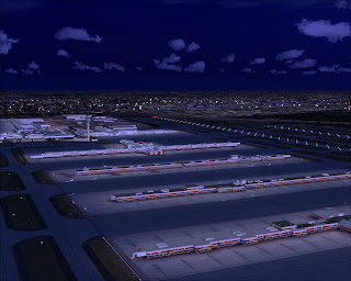
* * * AIRPORT AT NIGHT * * *
The new Maynard-Jackson concourse. The design is irreproachable but the windows, at night, would have desserved a better definition. Through this very large window, we should see details of the lobbies for instance.
I really liked this detail. Look at this aircraft shadow !
Arrivals to the Maynard H. Jackson Jr have no cars traffic but it would have been tricky, probably, to develop a custom traffic here. It's a real mess with many multi-level structures.
The new terminal, open in last may, with its glass roof structure.
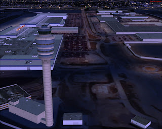
Much mode details around the control tower than in the previous edition. Static cars on parking,
Concourses are surrounded by many static or moving vehicules. These concrete barriers are new in this version. Very dirty and realistic.
Maybe an animated train in the V.4 version ? All the major developers (see UK 2000 London City, Aerosoft Dusseldorf, Flightbeam Phoenix...) are now including these shuttles on their airports. Even SunSkyJet made one for KPHL !
* * * * Comparison Atlanta V.2 versus V.3 * * *
In the first version, 2/3 years ago, the Maynard-Jackson area is still at an earth-moving stage.
To the left, the 2009/2010 version. To the right, the 2012 V.3. latest version.
In the blue circles, clear improvements on the ground textures. More details of the apron structure are visible. And at gate, more plots have been inserted.
To the left, the latest version displays better textures, especially on the terminal roof. Vehicules have lights, there are much more objects on the ground (containers) and the lights projected on the aprons are more effective.
* * *
Another comparison, from the western side of the airport (Air transportation, Marta station..). Hundres of cars have been added on the new version. High resolution on ground textures.
Imagine Sim Atlanta Hartsfield V.1 (2010)
Imagine Sim Atlanta Hartsfield V.2 (2012)
Atlanta latest version V.3
Not a lot of differences on these terminal facades. The texture resolution is exactly the same. As usual, i think that these walls should be designed with the highest possible definition since, virtual pilots are spending a lot of time here at gate. I am not forgetting that the framerate, at KATL, IS the highest priority...
and... Atlanta september 2010 version
Anyway, at dusk, these terminals really look great and have really been enhanced with the new vehicules fleet and the better ground textures.
Smooth approach on a mid-core processor (I5).
Conclusion :
Preserving the framerate while improving the textures, adding a thousand of cars and more objects (Atlanta Hartsfield vehicules, trailers, new type of concrete barriers) was a real challenge. It's done and even greater than that, the scenery includes the new Maynard H. Jackson JKr terminal.
The next step ? What we would like to see ? More and more technical skills on structures. The east side entry to the airport (and to the new terminal) is very complex. I am curious about what Imagine Sim will be able to do about in... 2014 ? Until this new rendez-vous, Atlanta V.3 (that's how i call this version) is really interesting considering all the airports released these last months, like Saint-Louis (Taxi2gate) or Myrtle Beach (The Airport Guys).
Thanks !
Airdailyx November 2012
Dom Mason
For the FS9 Review by D'Andre :
http://airdailyx.blogspot.com/2012/09/hartsfield-jackson-atlanta-our-own.html


2 comments:
Basically just paid for the same version again. Models look exactly the same.
These guys make some pretty good scenery. The one thing that I feel they need to do, that would be a simple fix, is to add mipmaps to the building textures to prevent the shimmering effects you see on approach. Otherwise, it's top notch!
Post a Comment
Comments are now deactivated. Please visit our new website: AirDailyX.net
Note: Only a member of this blog may post a comment.