Where to begin on this one? It's Atlanta. By far the busiest airport in the world. It may feasibly be a simple undertaking considering the similarity between all the terminals. Easy to do a cut&paste job. So the question all of you out there are wondering: Is it worth it? Did Imagine do it justice this time? Should I really shove out the extra $28 bucks? Well lucky for you lot, you have me at your disposal to help determine the answers to these questions. After a thorough analysis of the product, my feelings are very clear here. Did Imagine pass the test? We are about to find out!
Bandwidth Warning! Nearly 80 screenshots are in here to help me help you decide whether or not you should go out and buy it! Okay intro is complete. LET'S GO!
Is it real enough?
I remember when ImagineSim broke ground on their first line of products. I found it quite difficult to bring myself to purchase them. They were not bad, just somehow lacking in detail. Somehow, toyish. They just didn't have the quality that moved me in the ways FlyTampa, Cloud9, GAP etc. had the ability to do. Even today, I still somewhat consider ImagineSim to just be behind the elite crowd of developers getting close but never just quite able to keep up and join the ranks of what I consider to be the elite in FS development teams.
However, having said that, what I really admire about ImagineSim is the determination and the drive they have shown through major improvement with the advent of their Singapore scenery. It still was not in my opinion to be a 5 star scenery as say Drzwiecki's EPKK, but I surely gave it 3 and a half stars. There are just elements in the sceneries that seem to fall short with my expectations. I really do feel that ImagineSim is lingering at the threshold of the elite developers but there just seems to be something that keeps holding them back. I did a lot of pondering on this and after really pouring over the ATL scenery, I have drawn my own conclusions of what these areas are and what I believe they need to do in order to finally surpass that threshold.
Now in getting back to ImagineSim's Atlanta. Is it real enough? Well in a word: YES! and here's why.
First of all, I was never really impressed with Imagine's first rendition of this airport and I'll be honest, I really felt the worlds most important airport needed the kind of touch only FlyTampa, or FSDT was capable of. These guys set out to build a Ferrari and rolled out a Honda Civic. It just was not up to the par - that in my opinion, ATL deserved.
But as I just said, ImagineSim did not just sit idle by and continue to develop the same quality over and over. The team has really been making a concerted effort over the past 5 sceneries to improve their technique and overall quality of their work. Because of this, they have my respect and my money.
But the question remains: Has the team improved enough to take on ATL again? Are the improvements good enough to justify charging existing ATL customers all over again instead of a more affordable upgrade fee?
Well to this I say yes... and no. Confusing? Yes I know. But just stick with me here for a moment and we will reach a definitive conclusion. I promise.
So yes, as I said, this version of ATL is quite real enough indeed and there are many improvements I see here that not only make it real enough but there are also elements here that bring it to life as well. So you very well could say the texture quality here could be improved to have that FlyTampa or FSDT look. But honestly, not only is the work really good enough, it is also quite satisfying as well. So the satisfaction that lacked in the first version was more than accounted for in this new version. And frankly, I'm quite pleased.
It is very real enough.
So now let's take a closer look at the work and dive into what makes the updated work not only good, but a work I can finally say ATL is worthy of.
Now it's not just overall improvements that make the new ATL a worthwhile buy. It's also the new scenery elements that have been added as well. Let's start with the newly modeled Maynard H. Jackson Jr. International Terminal. I'm sure everyone is most interested in this part of the scenery.
Now whereas the overall looks and feel of the terminal are very realistic enough, there are some elements here that I found confusing. For example, if you look at the pre-composite graphical illustrations vs the actual completed terminal in real world, you will see that the building has a sort of silver metallic finish composed in rectangular grids. Here in the scenery, we have a white (non metallic) square grid finish. The simulated glass on the terminal is also seemingly incorrect as well. The rows of glass are arranged in a horizontal rectangular fashion whereas the actual windows in real-world have more of a longer vertical arrangement.

Is this really a big deal? Well I kept asking myself this and whereas the glass work is not much of a big deal, the real terminal is metallic. This creation is white. So as i continued to look for more pictures online, I found some photos that appeared to give the appearance that the entire building is white as well. Maybe it has someting to do with how the Sun reflects off the structure. From up close it looks silver matallic. From afar it looks white. Thus what I can say here is Imagine did a very good job with the overall look of the building and that is good enough for me. Infact the only thing that would have made it look better would have been photoreal windows which I am sure Imagine was not able to get or a transparent look what is quite complicated. So overall I can infatically say the new terminal looks great and I am very happy with it.

Textures. The textures we see here are in my opinion the very best ImagineSim has ever compiled. This is the proof in the pudding I am talking about when I say this team is improving their techniques. Without a doubt, with each release they are learning and improving. This texture work honestly looks very good. The maturity is really showing.
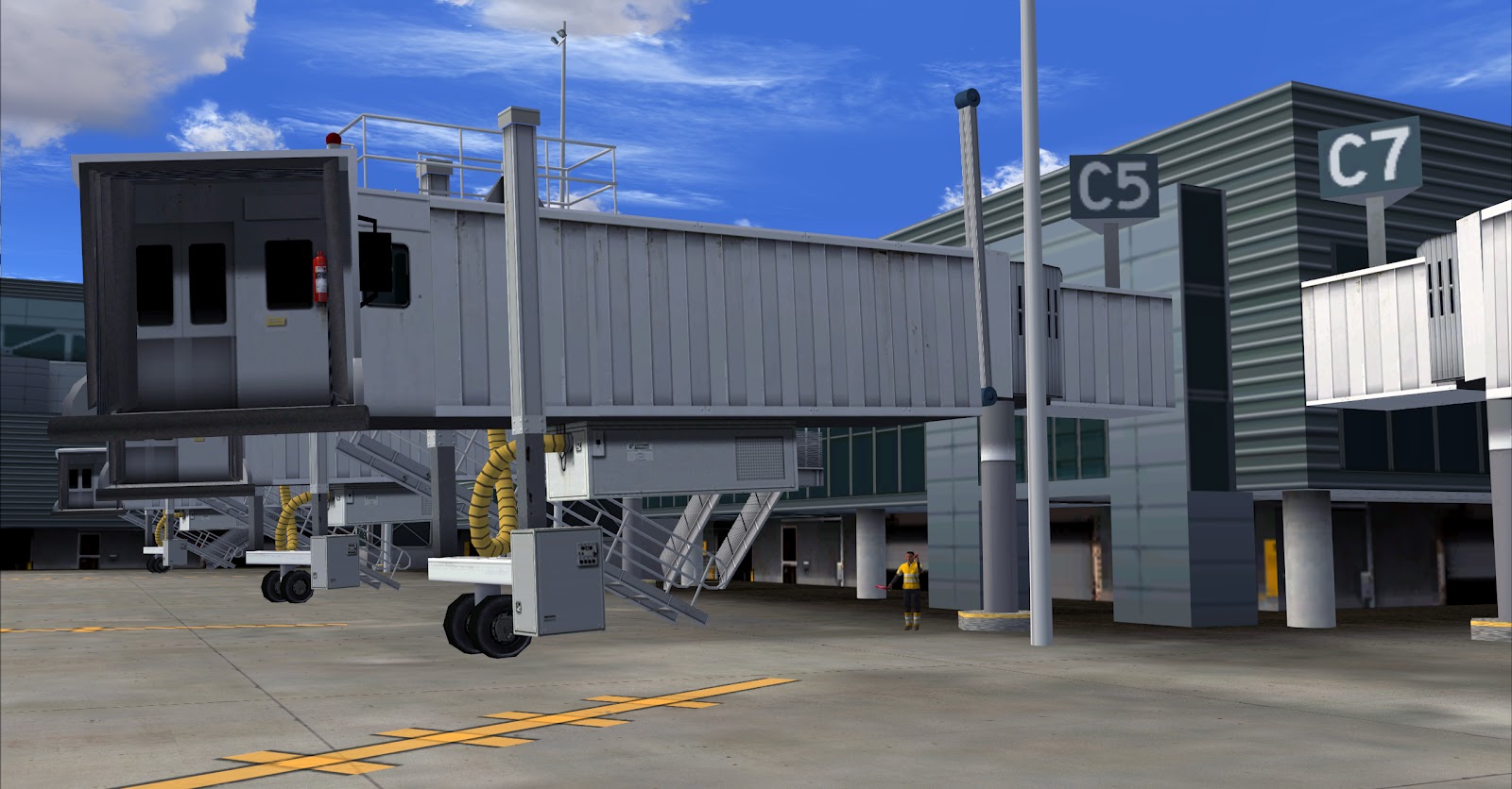
Another thing I want to point out here is with the vechicles. ImagineSim's vehicles just used have such a generic toyish look to them but clearly not anymore. These trucks here look very mature and would fit in very well as AES lite vechicles. What is even better, is quite a few of these trucks are animated one of the aforementioned elements that bring the scenery to life. Very well done here.
Another feature that makes the worlds busiest airport more alive is the well detailed "ramp furniture" cluttering the ramp areas. Not only are the container ULD's well represented with dollies, they are also located in their correctly designated places on the ramp. The same goes for the safety cones we see here too.
The ramp vechicles are not too cluttered and they all have those annoying blinking yellow lights but it's few enough of them that I actually found the little flashy lights acceptable.
Another thing I respect here is actually the terminal model itself. We are accustomed to seeing ImagineSim sticking with airports composed of mostly squarish buildings. This terminal has a lot of sexy corners and curves and every one is represented true to life. Very well done here.
Overall, I am impressed with how accurate the terminal object actually is. The detail is quite on point as well. As I said before, ImagineSim is really making a concerted effort to improve the quality of their works.
GSE and containers neatly lined up and not scattered about the ramp like I have seen in other sceneries.
All the "glass" parts of the terminal are in their correct places and positions.
Again, everything with the terminal model looks very good and I think you all will agree. But as I also mentioned, there are some elements that I think is holding ImagineSim back and I am going to point out one element now: The ground textures. The textures here lack the sharpness, depth, and detail I have been accustomed to seeing in all sceneries these days. To see just what I am talking about, let's make some comparisons.
ISIM new ATL
LVFR KMIA
TSIM TNCA
FSDT KFLL
Based on the photos of other FS9 airports above, you can really see that there is a real difference with the ground textures. I would like to see ImagineSim put more focus in this department for future improvement. It's really amazing just how much ground textures affect the overall look of a scenery.
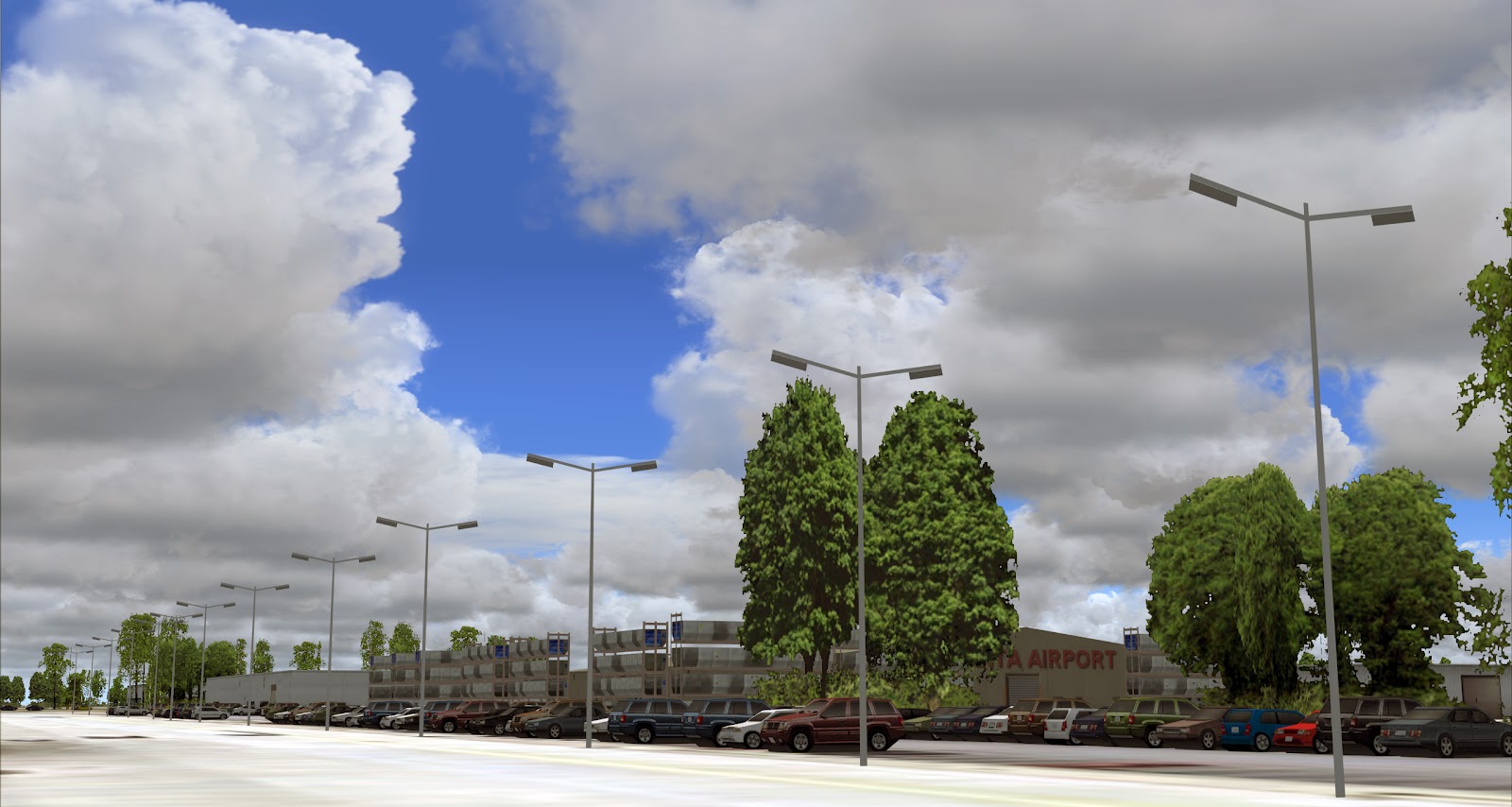
Some other additions we see to this updated version is the addition of thousands of cars present in the surrounding parking lots as well as a better job was done to ensure the surrounding autogen was not excluded too far away from the airport scenery. The autogen trees and buildings come close to the perimeter fence. This is something a lot of developers including FSDT seem to get wrong, time after time. I just hate large void areas surrounding my airports.
All the taxi markings and signs are in their correct places. From afar, we get another view of the international terminal. It all comes together very nicely. And yes: we DO fly Delta jets! I am a Delta Gold member myself!
Here again we see very good detail of the placed objects but the ground textures are just not up to par with the blurry look; lack of sharpness we see here.
Another thing done very well are all the cars in the lots and the fences placed around the airport. These are 2 things I am well known to make a fuss about. No complaints here. And the cars look VERY good on approach. The lots are filled with them and there was no impact on frames. Well done.
But now I sadly must go negative again. The developers did an outstanding job with the visible multi story car park you see on the right. It's complete with cars on the upper and lower levels, but where is the elevated terminal road that separates the arrival and departure levels? They completely left it out of the scenery even though it's present in the ground image. It's not a deal breaker, but I think it should have been added with parked taxis and busses above and below etc. On a good note, I really did like the transparent glass work.

Moving over to the signature red terminals ATL is so famous for. An ImagineSim developer will need to come on here and correct me if I am wrong but I honestly see very little difference between these terminals and the ones in the previous version. The only difference I really see is the ramp objects. So I am assuming these are the same textured objects as in the previous scenery. Which brings me back to my earlier question: Should owners of the previous version really pay full price for a completely new version? Can we compare these old/new margins to the likes of say Tampa Rebooted? I am not comparing this to FlyTampa only the old Tampa, vs. the new Tampa. Another argument could be made that perhaps these terminals did not need to be redone. You be the judge.

What I will say is that ImagineSim captured the look and essence of the older terminals enough that I don't really have anything negative to say about them. I want to believe they have been improved. But comparing them to the older counterpart, the texturing honestly looks the same to me. As I said, I have spent quite a bit of time at this airport in the past and can say from my own experience: these textures are more than good enough.
In my opinion, the jetbridge textures could be improved as well. Some may feel that I am nitpicking but honestly, if all these areas I am pointing out saw improvement it would improve the overall look of the entire scenery. It's my firm belief that it's the lack of quality in these areas that is keeping ImagineSim from joining the higher ranks of FS scenery development. These little things are a big deal.
ISIM new ATL
LVFR KMIA
FSDT KFLL
BPS KSFO
You have to honestly admit, if one of these above jetbridges were connected to ImagineSim's ATL, it would make a huge difference to the overall look of the terminal models. Believe it or not, in flight simulation, even some of the smallest things make the biggest differences.
Here we see a complete view of the airfield. Looking very nice.
Without a doubt, this really has a very accurate look of Atlanta.
I really like the added ramp objects.
Nice touch with the road sign.
Lots of new objects added including the seperation of the service roads with the use of k-rails concrete barriers, poles etc.
Without a doubt, this version of Atlanta is very much superior to the previous version.
Cars, cars, cars!!!
I LOVE IT!!!!
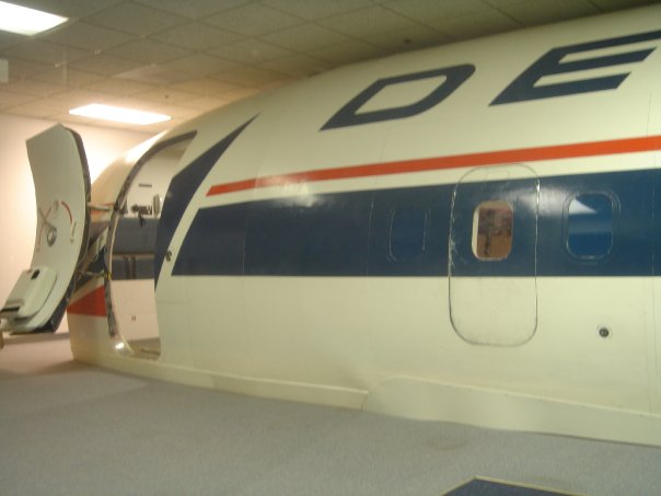
Here we have the complete Delta training center. I have had many memories here! Here are some exclusive shots of the inside during my training in 2007.
Some very fun memories in this pool I will never forget!
Okay back to the review. Another area that saw alot of improvement is in the cargo areas.
Here the textures were improved quite a bit. Well done!
The next improvement is one that is the biggest over the previous version. The aerial image. The difference is HUGE and in itself improves the scenery 100%. I was very impressed in this area.
Here the taxi bridge is flattened. Even though the German Airports Team and FlyTampa proved 3D taxi bridges are possible, ImagineSim choose not to follow this trend. However, we are even seeing TropicalSim implementing taxi bridges including FlightBeam in FSX. Therefore I am going to be honest when I say I hope ImagineSim makes the effort to implement the taxibrige in FSX.
Now on to the night textures.
One thing I really liked about the night textures on the windows is the feeling of depth. It's almost like you can see directly into the terminal. Great job here!
Note the car's headlights and the illumination they cast on the ground. Nice touch!
Again with the headlights. And that is a vehicle in motion too!
All the airfield lights represented perfectly. Including the Renaissance Hotel where I have spend many hours plane spotting!
So overall what is the verdict? Well based on what we have seen so far in this review, it's very clear ImagineSim did a great job upgrading the airport for 2012. I myself am happy with the improvements the team made here. But is it worth the complete repurchase? In my opinion, there should have been a discount for those who purchased the original product. Perhaps a 5 bucks discount? Overall, I do feel the product is worth the price. Yes, I do believe there are some improvements ImagineSim needs to implement in the future and I am fully confident that over the next year as they continue develop sceneries they will reach the elite.
If you bought the older KATL and if you are uncertain if you should get the new version, I hereby recommend on behalf of AirDailyX that you get it. The improvements here are simply too good not to buy it.
Thanks for reading!
Cheers!
D'Andre
AirDailyX - We do things differently!


15 comments:
I must say, excellent review, wonderful pics...i will buy!! For FSX that is
Thank you Brad! We will def have some FSX shots posted when the scenery is ready.
((-D'))
I love the pictures. This might be the first product from Intersky that im going to purchase (for FSX)- it seems as they have improved tremendously! The only "problem" might be the FPS - port-overs from FS9 can be a quite hard on FPS - please pay close attention to it when you check the FSX-Version and report the results! Thanks!
Really nice review. More articles like this please.
ATL looks much better than Latin VFR's efforts but much worst than FSDT/FT. I might just buy it if the FSX port doesn't suck.
I like it. It looks good. One thing for me is the basics. When I am at an airport I want to see details important to the location, Flowerbeds out near a parking lot and fluff, however good looking ramp areas are a must. One other thing that I see a lot of failures ate is blending the airport. too many add on airports are just the airports and a few structures--I noticed that the recent Sky Harbor release is MISSING the huge parking structures to the west and a lot of off airport details should have been added, such details are needed on the basic approach and departure lines of flight-Overall Atlanta is a pretty dull airport in real life, but I still will buy this as it looks good to me
What are you using to take screenshots?? There seems to be no loss in quality at all!! I currently use FRAPS and save shots as Jpegs but there's still a slight loss in quality....
Thanks for the thorough review. I look forward to your thoughts when they release their FSX version.
Thanks for all the kind comments! My goal here is to attempt to support the developers and the community as best as i can while being honest. Nearly 500 of you read the review in less than 24 hours. Cheers! And yes, I will bring you all some high quality FSX shots like I did with KPHX.
Try setting your Fraps output format to BMP. In this way the anti aliasing wont be lost. You can always convert it back to JPEG in CS afterwards. Let me know how it works out. Of course I have a few other tricks up my sleeve though...
You are right! ATL is not the best looking airport in the world. This is another reason I feel ISIM captured it so well. But the jet bridges and ground image in the ramp areas need to be improved. Even my wife noticed this and she was not impressed.
I didn't see any mention as to whether or not the jetways are animated. I have their KDEN with static gateways, wish they could move. What and who by the way is AES?
I am sure it will be covered in a future AES update the same with KDEN.
I downloaded a demo of this scenery, but noticed it is a bit hard on FPS (FS9). Anyone else experiencing the same?
One thing I noticed with this scenery, mainly the AFCAD is that there are several parking spaces (gates) that are not being used so far I have counted and fixed for my use 4 on the T concourse, 8 on A concourse. Then as I am looking at it some more I find some gates on the D concourse are still assigned to Northwest. Then on the E concourse they didn't include some startup airlines (Georgia Skies and Silver Airways) which operate from Gate E37. It looks like they used the AFCAD file from the original KATL. With this being an update/refresh of KATL you would think it would be current. like you I am a Skymiles member (Diamond) and fly out of ATL quite often so I guess this is why I notice these things that are wrong with the AFCAD. Other than that I like the scenery.
Personally, with 90% of the sceneries I buy, I have to rework the afcads anyway. Few developers get it perfect.
Post a Comment
Comments are now deactivated. Please visit our new website: AirDailyX.net
Note: Only a member of this blog may post a comment.