We'll i'm at it again! So this time I am heading East. Way East! This is a developer I have been watching for some time and for the most part, his work improves with every release. In fact, the only thing really keeping me from buying up all his projects is the complete lack of AES. And that really sucks because the technique used in his works are really indigenously original to his development style. His most recent work however, rubs me in a weird way. I can't quite put my finger on why I feel so weird about this scenery. It's bad but yet, it's good. It's
very good! But not really, but it really is! Sort of... Ughhh!!! Just come with me as I get my thoughts and screenshots together on this.
Bandwidth Warning! Heaps of screenshots and rambling!
Now what I will say is this is an airport that has been needed ever since Aerosoft released the Lukla airport scenery years ago. Is that airport still called Lukla? Anyway, I really love the Lukla scenery but the airlines visiting there for the most part fly out of Kathmandu and considering how remote the Lukla scenery was at the time, I would simply takeoff, turn a circle, and approach... again, and again. Sometimes I would fly to the other dirt airstrips in the scenery area but that wasn't enough. Finally my circling days are over and I can fly out of the Himalayas and down to the valley into a proper scenery.

The thing is, I am not quite sure how I feel about this scenery. And as most of you know, my impressions are really about how I, (as a very passionate flight simulator enthusiast) am impacted by the products developed for my simulator. Usually, my thoughts are quite clear and concise about how I feel about a product. Either I like it overall or I don't. Now if I flat out don't like a product, then I would never waste my time doing a review for it. But... hey.. I guess I am doing a review about this one so I guess this means I like it. Right? I think we are making progress here.
So yeah, alright. I like it. But there is still something about it that I can't quite put my finger on. So let's talk about what I know I like and maybe perhaps that will filter out and subsequently narrow down my feelings to what I don't like. By then, we all should know why I am all weirded out.
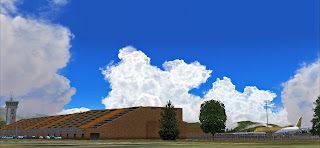
Now in my opinion the feature that grabs the eye on approach is the photo scenery and "awkwardgen" what I am calling the autogen in this scenery. Next is the ground textures which was very lovely crafted. But more on those two later. Besides this, regardless what direction you are approaching from, once you exit the runway, it's that horrible looking assortment of bricks that comes into view dead ahead. That's right, the main terminal.

Now I don't mean to be an ass but let's call a spade, a spade. That building is ugly. I have no information on who designed it or if there are any cultural references to it's design. I personally don't like it. But this is not the first scenery I have purchased where I felt the architecture was horrible. So why did I buy it? Because the scenery developer did such a great job capturing the essence, environment, and realism of the real thing. That's where I seem to grow a sort of profound respect for. So even if a building or aircraft is ugly in real life, when a developer get's it correct in the simulation, then I grow a likeness to it because it adds a level of realism and thus almost gives the feeling of actually being there. Most airports in FS are so beautiful and modern. Well an airport like this putts balance to the scale. It's raw and gritty and the developer was very successful capturing this grittiness and implementing it into the simulation. Well done!

Now is it me or are these type of cars really common in this region? This could easy be a Walmart parking lot anywhere in the States... What I do like here is the fact that he chose to populate the lot full of cars. And yes, there are some animated cars roaming the lot.
And on to what I consider to be one of the main reasons why I am feeling awkard about this scenery. The textures. Now referring to this horrid brick ensemble, from afar everything really looks as it should. But it's when you really get up close does everything seem to blur leaving me to wonder: are these photo real textures? Did the developer visit the site in person? Was the developer not able to get close enough to the brick palace for higher res photos? Why does the quality deteriorate as you get closer? Previous scenery projects from this developer don't seem to have this issue.
So the reason I feel weird is because, it's like I can see it's detailed but it's not. But it is, but not really... Does anyone else see what I am talking about here? The closer to those bricks the more blurred they seem to become.
But then again, I can't recall at this moment another existing airport scenery with a composition of bricks as complex as this terminal. Could the resolution be higher? Absolutely. But the question is: should it be? Now I am all for the best realism possible, but by the bricks not looking so perfect in my opinion is what adds to the grittiness look of the building and perhaps gives off an even more realistic feel. But in this case, then at least the developer should have gone with photo real terminal windows. And THAT'S why I feel the way I do about this building. It's the windows!
Now please don't get me wrong here. I am not saying the windows look bad. I am saying this style of matte looking window is what's holding this terminal building from being all it can be. Something can really be learned here from the Polish team. So I re-ask the question if the developer actually visited the terminal or if it was all composed of photos found on the internet etc. If that's the case, then no worries. He did the best he could. Can't be mad about that.
Again in the above photo you can see how using photo real windows would have made a world of difference. The grey matte look really takes away from the realism and it affects the entire building.
This airport does get it's fair share of eclectic liveries from Europe, Asia, and the Middle East.
What I really love here is all clutter of ground support equipment ready to take on a fleet of planes at any moment. But alas, they are only static. But they look ready to work and that's the whole point! The developer really complimented the entire ramp this way, well done.
The other thing that impresses is the ground textures. Not clean but dirty and stained. The markings look very good too. Very talented work here.
And we have some custom passenger buses. Some of these are animated and roam about the ramp area but beware, they will not stop for you.
More nicely done custom ramp objects and ground markings.
Now I do have a bone to pick with the next picture below. Instead of using photo real interior photos of these hangars, the developer really should have modeled the insides. Here the photo images are too dark, all I see is black, and these photos really lack details. My first flight here was in a cargo AC50 from Lukla. I thought to park here but when I got there I was disappointed. Nothing to see. But the surrounding ramp area was well populated with various objects.
Good looking building. Again, would have been much better with photoreal glass...
Another shot of the hangar ramp. Nice looking fire trucks.
Fencing is VERY important in my book! Very good looking fences covering the entire airport.
Lots of ULD's and dollies cluttering the ramp. Nice.
Here is a good overall shot of the ground textures and surrounding photo scenery with very good looking trees. There were not enough trees!!
I just love the runway texturing! Very well done here!! On approach, you really get the feeling of a real runway underneath your tires! I can't express enough how good a job was done here!
A lot of firetrucks for such a small airport eh?
How did I go without mentioning the control tower???? I have to express just how well the tower was modeled!! Perfect texturing, transparent glass, the color... Perfect!!
Okay so back to the awkardgen. I say it's awkward looking because awkward look of the autogen. However, after looking at photos of the surrounding areas, it's very clear the look and feel he was going for. And to be honest, he was not far off point. So what really makes it all awkward is how the autogen was placed. Just randomly plopped about instead of strategically placing the buildings over the building locations as shown on the photo layer. The lack of trees furthers the situation.

My next point would be the photo scenery itself. Have you ever had to throw up and you take a second to glance at all the kibbles and bits floating about the bile? Well... And the color too... it's just off somehow. I would like to inquire if there was a better photo scenery available. To be fair, I know it's expensive. If the choice would be this or no photo scenery at all, then I would elect to have it. But you can clearly see how the airport photo scenery seems to be overwhelmed by the surrounding area.
To compare, here is a photo I snapped from Google Earth covering the same area and angle.
Now, I obviously don't want to beat up on the developer here. I would not do a review at all if I felt it wasn't good. The thing is, it is good. It's worth my time, and I do recommend it. There is so much that was done right among what could be improved. Scenery development is a very time consuming business and sometimes you just can't make everything perfect. With this said, I want to go further with what was really done well. In fact, I would even go so far as to say this place looks better at night than the day. So let's have a looksie at the night textures shall we??
Now I am very excited about these night textures. In fact they were done so well, the only thing I could say for improvement is the the ramp lighting could be just a bit brighter.
The main terminal building is well lit in a very realistic way as well as the ground equipment. Very nice touch!
Here you get a better rendition of just how well the night textures flow over the brick facade.
The lights are very pristine here.
Here you can see the night textures on the GSE. Couple dudes chillin out...
The windows are well lit as well and you can see the rotating beacon illuminating from the top of the tower.
The winwows in front seem to have missed the night lights though. Not that you would be hanging out in front here at night anyway...
Even the awkardgen is well lit at night as well.
The runway and taxi lights are nothing short of perfect!
As the evening gets darker you can get more of a feel of the lights. Well done here!
And darker...
Overall, I really like the work here. You can clearly see where the developer put in a lot of time and effort. Ulitimately, this is one of the more realistic looking sceneries I have seen and I am glad to see this part of Asia get coverage. There is so much here that I like and the overall look and feel of the environment that is Tribhuvan International Airport was captured perfectly. Sure there are things that could have been done better, there were some important things left out such the airport entrance, but that is true of any scenery.
What's important here is the developer did not just bring us Tribhuvan, he brought the environment too. And let's not forget to mention the challenge he brought us as well. This is not an easy airport to approach regardless of what end of the runway you are landing. Real life will tell you the countless lives lost in the Kathmandu valley as aircraft in the distant past have tried and failed.
I really want to thank Thai Creation for finally bringing a Kathmandu that not only we can enjoy, but one that nearly perfectly represents the real airport. And I have to say, sorties to and from Lukla are so much fun!!
There are also some other very good payware airports in the area worth looking at. All within a 500 mile radius. let's see what you have to enjoy in this area!
IMAGINE SIM - NEW DELHI VIDP
SKYSOFT - LHASA GONGGAR AIRPORT TIBET ZULS
SKYSOFT - LINZHI MILIN AIRPORT TIBET ZUNZ
AEROSOFT ONLINE - LUKLA X MOUNT EVEREST
All lacking AES though...
I am sure there will be a lot more airports coming to the area!
For $19 bucks, its really in my opinion at an appropriate price point. You can go buy it now on Simmarket!
Here is the product page. You can read other user comments and buy it!
Again, great job and well done Thai Creations! We really appreciate the time and effort you put in here. But dude, you HAVE to get this stuff AES'd!!!
Now time for my next sortie!! Thanks for reading! And to my wife again for proff reading becuse my sphelling is horrble!
Cheers!
((-D')) D'Andre
Follow us on Twitter! / Like us on Facebook!
AirDailyX - we live and breathe flight simulation!


4 comments:
Interesting review! Hopefully the developer will port to FSX - I think a lot of folks have been waiting for a VNKT and there should be a good market for it... Many requests for info on their facebook page for a FSX version, but no response from the dev as to their intentions. Maybe an opportunity for someone else to do a competing VNKT.
He is a very quiet developer. We can only hope!
Cheers!
((-D'))
Agreed! Paro is really well done! With the opening of the Vatsim West Asia Division, VNKT would be a good seller for them... would be nice to know if it is in the plans!
Paro is a wonderful scenery!! I am still hoping for AES!!
Post a Comment
Comments are now deactivated. Please visit our new website: AirDailyX.net
Note: Only a member of this blog may post a comment.