The view from down here.
So one of the things I highly respect about this developer is the fact that they are starting off small. They are using these smaller works to learn, develop, explore, and improve. This is a wonderful thing for another reason as well: They are not biting off more than they can chew. That is a thing that kills off many new developers. Sure, we see them all the time, they pop up in places like FSDeveloper and Avsim. They even start up their own websites claiming a lot of bullshit they never deliver. Now I don't care what the reasons were. The bottom line is in each case they were starting off too big for their own good.
Another developer that comes to mind when I think of LHSim is Drzwiecki Design. Again, we had a group during its infancy offering "lite" freeware and payware sceneries of very small airfields. This is the right place to start. Because unless you are 150% certain you can complete what you start, it's best to start off small. VERY small. So for those naysayers saying "the airports are too small" or "I never been there so no point in buying it" or "it's just some backwood nowheresville airport" here is some advice for you: Take a look at where Drzeiecki and Orbix are today and look at where they started.
Who would have thought that small airfield maker DDesign would someday roll out the level of quality they did with Krakow, an although somewhat small airport, is by far the most detailed scenery to be produced for FS9. I think FlightZone's KPDX held that throne for several years. The reason I mention this is because LH have already stated they have gotten to work on Budapest International. If the level of quality is good here, just wait and see how they prove themselves there, and imagine how it might look if they started with that airport. The quality would be the very same as their first freeware: Balaton.
So that's why the view from down here is so important. Big things have small beginnings. Now let's see just why this small airport is so good.
As what is clearly becoming a trademark of LH is the beautiful grass, trees, plants, flowers, and shrubs. Here none was left out and is very beautifully laid out across this scenery. The attention to detail in this work is superb to say the least. And what LH has proven here is that "Orbix" type scenery can exist very well in FS9. And with Carenado returning to FS9 as well, there are some very nice aircraft to enjoy here.
Heading over to the main terminal it's clear how someone who has been here might mistake it for the real place. There is also another feature used in this terminal I have never seen on a scenery object before. Let's go in closer.
So about that feature, if you look at the windows not only is everything transparent through to the other side, but even the look of window blinds were simulated here. And not to mention the reflection textures. This is a feature I have not seen before and I really would like to see more of this in the future. Very realistic feature!
From the inside you get a better idea of what I am talking about. I applaud the developer for really going for such a realistic look. This is what I admire about LHSim, the time taken and passion really shows here.
Turning our heads we get a very impressive look at the airfield and a very simple yet high tech setup. Note the screens, I love when developers do stuff like this. Most people may not care to walk up the stairs and peak in here, but I do and the developer gave me something to admire. Nice work.
Also note the photoreal shadows and the catwalk. Well done there.
Now here we see a perfect fusion of photoreal glass vs. transparent glass. The photoreal is of very good quality so there is a very good amount of depth. The developer could have clad the control room in photoreal glass too but as you can clearly see, the transparent glass is much better and still blends perfectly with the photoglass used on the ground floor.
Okay moving away from that beautiful tower model we have a look at the other objects. Above we have the fuel tanks. Yes! Those are the fuel tanks! Cool!
It looks like nothing was left out! Even a simple wooden trashcan. I can just imagine people looking at the photographer like he is crazy hovering over a trashcan on his knees with a big SLR snapping shots. I just love the brush and grass!!
Another well detailed area.
Like I said. Nothing was left out.
OOPS! BUSTED! Here we see our lovely developer getting caught into the scenery taking a picture of himself in the glass reflection. LOL!
Clearly a lot of time and effort went into the rendering of each and every object. The passion here is very clear.
Here we get another look of how good the photoreal quality really is. Very good depth in the glass. Good quality in the wooden doors.
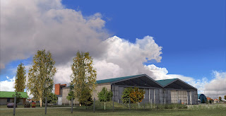
Moving to the main hangar (another object done well) the entire object is true to reality and the inside is even better!
Is this flight simulator or real life?? I don't know!!
No detail was left out!
I really love the interior texturing of the hangar. It's just so real!
Beautiful trees, plants and shrubs create such an exciting environment.
Again, nothing was left out. This is how well scenery can be done when a developer has unrestricted access to an airport.
Again, super realistic!
Well modeled!
Is that graffiti? Wait...They let him on the roof to take pictures of the graffiti?? Well if it's there is real life then...
The surrounding neighborhood gives a perfect environmental feel of the area.
Here we have the airport tarmac entrance where Audi executives enter and exit to their corporate jets. Yes, an important role of this airport is to serve the Audi plant just a few miles away. I believe the TT is made here.
Ooh and here are some Audi cars as we speak!
Among the best static cars I have ever seen. Too bad none are animated.
The quality here is among the most realistic I have ever seen in flight simulation.
John V and Stan, eat your hearts out! Just look at the depth, the detail even the road is somehow so realistic. I have never been here but it's so clear just how much this resembles the real place. Totally amazing.
I can almost see my own reflection in the glass as I sit at my computer!
So now that we have had a very extensive look at LHPR let's hop into my little Carenado and head over to LHBY and see the other awesome features of this magnificent scenery! Let's go!!
Bony Gyorszentivan. Our impression!
So now that we have completed the very short flight to LHBY, let's see just exactly why this little airfield is the most exciting European grass runway you have ever landed on.
Now what is so amazing about this airport is its natural look and feel. LH has managed to honestly make the environment so real, scenic, and true to life. Simply amazing. FS9 has come a long way.
I just can't get enough of shots like this. Of course the only thing better than looking at these pretty pictures is flying into them.
The detail and realism is so real here. It's a great experience to fly here.
Descending into this grass runway is so much fun!
Now that Carnado has returned to FS9, I hope Alabeo will consider FS9 as well so I can dust the crops here! That would be much fun!
Plenty of crops here need dusting.
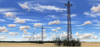
Again here we have a very realistic countryside. The buildings brought to life perfectly in FS.
The detail is among the highest I have seen.
A Kodak moment here.
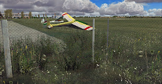
Very nice static and the coloring is nice too! Great textures. Too bad... I want to fly that plane.
As always, the developer leaves nothing out.
Bushes, trees, plants, weeds.... All so beautiful.
Perfectly done. It's so clear how much passion the developer has here.
Here we have a look at the entire scenery area with both airfields visible complete with plenty of accurately modeled autogen...
Lets go winter. I call it: Smart Winter because the winter is not just about textures here.
One thing I like about the smart winter here is the realistic absence of the crops. These can not grow in winter and here the developer took the time to ensure everything looks right in this season. This was very well done.
Another thing about this smart winter, is the grass texture changes too. It's really a different experience with each season. If you want to see the beautiful Spring and Autumn textures you will need to buy your own copy of the scenery.
I really wish the tractor was animated. It's just too beautiful to sit there.
Another look at those lovely grass winter textures.
Even the bushes have a touch of snow.
Okay and the biggest thing I love about this smart winter is all the gliders are moved inside from the airfield into the hangar. I don't think I have ever seen anything like this before. I recently saw a post in the Aerosoft forum about this. See the link here: http://forum.aerosoft.com/index.php?/topic/55154-mega-airport-rome-fiumicino-preview/page__st__80
Basically an Aerosoft forum user by the name of "and-pilot" said that that he would like to see hay bales in the fields surrounding the Rome Fiume scenery in development. But then a user by the name of PatrickZ said the following: "I think that would be difficult because if you know only a little bit about farming you know there is a season for hay. These bales will be there in the summer, but not in the winter or spring. But scenery objects cannot be there in one season and not be there in another one. Either they're always there or they're never there."
Well Mr. Patrick, LHSimulations has just proven you wrong!
Now earlier, I mentioned this is this is the nicest scenery you won't buy this year. I am finding negative comments all over the internet about this product including Avsim. Here are 2 sad comments of the lot I found:
__________
"It's payware now! Very painful..."
"oops yeah- payware :-( Why are there are so few simmers left in the community that can do these things for sport like the Dutch NL2000 team? FS in the early days [Fs 5 , 6 , 7, 8 up to 9 ] used to be all Freeware stuff and hardly any payware. That's completely changed and takes a bit of the fun and adventure away."
__________
Now don't get me wrong, there were a lot of good comments as well. But I honestly can't believe how ignorant prople like this could possibly say such things. Is there no regard for the amount of time and money that goes into a project like this? Is there no respect for the innovation of new techniques implemented here? Yes, these are small scenery projects in terms of scale but they are big in an important way when it comes to detail, passion, and patience.
LHSim has done an amazing job here and this impression does not do it justice. But what does do it justice, is for you to go and buy it. Support this team. Show them you respect the hard work. Because it can only get bigger and better in the future.
A great look at the ground work!
Let's look at the night shots!
OOPS! Something got past the beta testing process! Remember developers, the ADX editors are always available for beta testing. I would have caught that! Oh, I guess I did!
The night textures are very impressive here,
The whole town lights up and very nice lighting in the hangar.
Very well done.
So whereas I can not say that anything in this project was wrong. I can say what I would have liked to see.
First, the photoscenery coverage area is just too small. I would have liked to see the area expanded. Also the Audi car plant will be included in the coming days, I would have liked to see the photoscenery at least extend to that area. The next thing is the roads. It would have been much better to see the roads cover all the neighborhood areas and not the dirt roads. The last thing is the lack of animated vehicles. That is a total let down.... The work is so real but seems too still. Some moving cars would have really brought the scenery to life.
LH is working on an AI package that will look very nice. I look forward to that.
Again, great job to the LH team and we are very excited about the next project!
Now it's time go and fly!
Thanks for reading!
Cheers!
D'Andre Newman
Follow us on Twitter! / Like us on Facebook!
AirDailyX - Passionate about flight simulation!


3 comments:
You should check the Road signs near LHBY... there is a nice surprise there :D
Really? I missed something? Hmm...
http://airdailyx.blogspot.com/2012/02/smile-during-sad-moment.html
http://airdailyx.blogspot.com/2012/02/interesting-statement-from-lh.html
Ah yes! I am aware of those signs. You can check the above 2 links!
Cheers!
Post a Comment
Comments are now deactivated. Please visit our new website: AirDailyX.net
Note: Only a member of this blog may post a comment.