And now finally we head over to the 3rd and final airport in this series of Polish Airports Vol.3. My feelings on this destination may appear a bit more mixed then the two previous Polish destination. However, there are some features in this scenery that indeed reflect the impressive skill Drzewiecki is increasingly becoming infamous for. I also take a peak of several Polish airports completeting construction this year that show a very potentially promising future in Poland's represintation in our simulatiors. Of course, that it assuming the Dzrewiecki Design team is up to the task. Alright peoplez, let's bounce!!
Bandwidth Warning! Super long post and lots of mouthwatering shots inside! EDIT: All of the concerns I raised in this review have been corrected with the latest update!
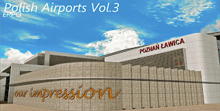
Now as I said earlier, I do have some mixed feelings regarding this scenery. However, what I like about the project far outweighs what I either disliked or felt where changes were needed. As always, the team did a great job making use of photoreal textures on the windows at the passenger entrance side of the main terminal.
This is the type of quality I am coming to expect from this talented team. I can almost see my own reflection in the glass. It's nice to see high quality realism have no affect on frames at all. I also like the texturing of the walls. Is that concrete? Very well defined.
Again very well done here. The definition of the textures and shapes are very close to the real thingOne thing that is a big deal to me is a populated parking lot. These are the sort of cars I would expect in this region. The are are also well put together. I can think of a few developers who can get quite lazy when it comes to this.
I am also a big fan parking lot billboard ads.
Here you get a good view of the main building and the quality it encompasses.Look closely at the wall there. Very good quality. Also note the transparent glass canopy.
Here on the airside, we get a good look of the glass and exterior walls. I really like the detail here. Sadly still missing the bus textures I noted in the first review of vol.3. I believe a fix was sent out but I have been too busy to do it so my fault here as I completely forgot about this issue before I got all screenshot trigger happy.
And lets get closer... Good depth!! I love the talent from this team!!
From the same side we get a better look of the definition of the texturing work. Very well done here. The glass, the walls, the slightly hidden windows, everything here is perfect in comparison to the real thing.Here we get a shot of the airside. Now wheras this is one of the oldest airports in Poland, this section and building here is only about 12 years old so we have a fairly clean looking ramp.
The ramp textures are very sharp and well defined. However, we seem to be lacking the same quality of the photoreal window textures on the opposite side of the building. What happend here? I assume perhaps the photographers were not allowed in this area? My other beef is the complete lack of parmiter fencing in the scenery. So what happend there?? If we are going for such realism, how could that have been left out? Otherwise, if there are no fences then the photograpgers would have been able to just walk up and get some good shots of the glass. I was a bit dissapointed in these 2 areas...
Here we get a slightly elevated look and you can clearly see the photoreal glass is back. So the photographer was allowd on the roof to get that shot? I do assume there was a direct reason why the glass is different. Maybe they were not happy with the results. I am not saying the glass on the lower airside area looks bad. You can clearly see for yourself. I'm just wondering why it isn't the of the same photoreal quality.
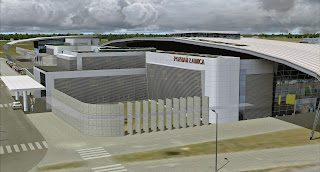
Now on the opposite side we get a good sense of artwork. This building has a lot of sharp angles and curvs. The team did a great job captureing every one. The only area it differs to the real building is it's color. The real building actually has more of a metallic look wheras this looks more white..
This is one of my favoriare shots here I really like the building design. It's very different and does not lack character.
Here we have a close up. You can see clearly the hard effort put in here. And you can see a window on the lower right side. Very good depth!!
Taks a closer look at the quality of something as simple as a wall. No detail was left out.
Here we go again with the glass!! I love this!!! This is what's so damn great about DDesign sceneries. Now tell me that glass doesn't look real?? I wish more developers would do this!! Most developers don't get to get this close and personal with the airports. Very good depth there. Great job team!! So why is this level of quality missing on the airside glass where we will spend most of our time visiting this place??
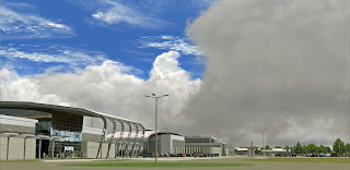
Here is a good pullback shot. Very nice!!
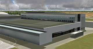
And now we move away from the main terminal to the logistics area.
And now we move into the excutive terminal area where I have no complaints at all. Only praise!
Here everything was done perfectly! The glass, wall textures, beautiful!
From this angle we get more definition of the glass and texture quality.
And now the masterpiece!! I just love this!! The detail!! Uncanny!!
I just couldn't help myself here. I really wanted to shoot just how complex this truly is!!
Here is another close up. I had to get on my knees and squeeze between the bars to get this shot. Shortly after, security came out and asked me to come back out. I banged my lens agaist one of the poles and scratched it! These people were looking at me like I was crazy so I yelled out at least i'm not ugly, look, I have moving arms and legs and you don't. My wife smacked me in back of the head for talking crap to my computer montior. Sometimes I get lost in the damn simulatior and forget where I am. The back of her hand brings me back to reality every now and then.
But really, my wife doesn't hit me. What?? She doesn't! I got that bruise falling off my skateboard. Look please don't send the police to my house!!
Okay lets get back to the review shall we?
I decided to put my personal SR22 on display here to assist with the advertising. I didn't get permission. I just taxied the thing right up here since there aren't any fences covering the airfield to keep me in. Hey, it's my simulator!! I do what ever the hell I want.
You have to admit, it does look good there. See that single mom is posing with her son in front of my plane. I assume she is single because what dad wouldn't want to be here??
Here we have some VERY nice Cirrus statics. You can compare with the actual aircraft. Very good statics!!
We have a very good modern looking firehouse. No 3D fire trucks though.
Ok. Here is another mixed feeling of mine. And by mixed, I mean negative. The photo groud layer is very sharp and detailed. So with a scenery this small, why not populate it with autogen? You really get the feeling the nearest town is several miles away out of sight when in fact there is a huge town right outsite the airport permeter. This was dissapointing. The other 2 airports had the autogen over the photoscenery so why was it skipped here?
In the Google Earth image you clearly see just how populated the area is. In the sim, its just open fields for miles.
Again we have some very sharp ground images here. Here is the famious Tor Pozan race track. It would have been cool to see some animated cars on the track. Speaking of which, there were no animated cars in this scenery that i could find. One thing I can say with Polish Airports Vol.3 is there is a lack of uniformity between the 3 airports.
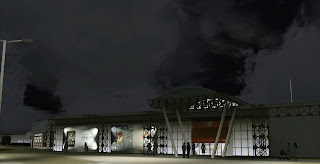
Now we move to the night shots. I have good and bad things to say here. Firstly, overall the night textures are sufficent. However, some parts of the building are not illumitated at all. For an airport which is a secured area, (without fences) I really would expect the entire building to be lit.
The other thing is the photoreal glass reflects daytime textures. What happend here?? This is what I mean when I say lack of uniformity. EPBY has PERFECT daytime reflective textures and at night there was a sort of 3D depth image into the terminal. Why did this not happen here? Did the photographer not stick around till sundown to get the night shots? This pretty much the same on all the windows except the rampside where photoreal glass was not used. Some parts of this scenery seem so perfectly detailed and other parts seem rushed or something.
Here again is a part of the scenery where everything was done right. The executive terminal is just perfect.
Even at the front everything is lit as it should be. Even the posterboard ads are illuimated with a directional light splash as if physical lights are there. Great attention to detail there.
Here you see the highway 307 well lit. Again, sad there were no animated cars here.
Overall, due to the fact that DDesign is setting and achieveing such high goals, I perhaps guess my expectations are getting higher as well. Now granted, this is a very small scenery and as such I don't want to come off as mean in any way. But I really feel what was done right was done perfect. And what wasn't is really minor but bugging nonetheless like the premeter fence. I feel this should have been added assuming the airport has one in real life.
The trees were very well crafted and there was not too much of the treewalls nor were they too obvious. Another feature I loved here were the Cirrus Static aircraft and some of the old origional buildings that I somehow left out. But that's okay. You have to explore a bit yourself too. So again, for what you get for the pric, and having 3 airports in the package, This honestly is a steal. And I want more. Much more.
Which brings me to my next point and question. Well we know DDesign is working on their biggest undertaking yet as they put focus on the entire city of Warsaw which will finally include Choipn airport. I was devistated years back when the team lost all the work they did on that project due to a harddrive failure. I had been following that project since the beginning. There is also the Tallinn project underway that will likely come Q1 2013.
But when the team returns focus back to these smaller Polish airports, I am going to be extremely excited. Because you HAVE to see the new generation of airports underway all over the Polish region. So now I would like to segway into what is going on in Poland and what I can't wait to get into my sim.
When you see what they are doing there, your mouth is going to water. We can then specluate what we are going to get!! Drzewiecki! Please take notes!!!
Lets start with... um... Okay!! Got it!
_____________________________________________________________
Gdańsk:
Here is what I hope they will make!!
OOH!! Look!! They actually made it!!
Okay what's next hmm... Okay I know!!
_____________________________________________________________
Łódź:
This would be nice if it gets built.
Ok what's next?? I know!
_____________________________________________________________
Rzeszów:
Would look like this:
Actually looks like this:
_____________________________________________________________
Lublin:
My first wish!!
Wouldn't it be awesome if this was actually built???
Oh yeah baby!!
You have to do this one Stan!!!
_____________________________________________________________
Modlin:
The brand new Modlin from the ground up would look like this:
And that is exactly what it's starting to look like!!
Ok this a very long post so just 2 more!!
_____________________________________________________________
Kelice:

_____________________________________________________________
And my personal favorite!!
Gdynia:
Just started construction!!
_____________________________________________________________You just wont believe how many of these projects are taking place across Poland!!! I did not list them all. But the purpose of this long ass post is clear: What is in store for us in Polish Airports Vol.4?
Thanks for reading as always!! You can finally go now!!!
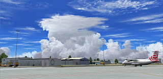
Parting winter shot...
...and now i'm gone!
Cheers!
((-D')) D'Andre
Follow us on Twitter! / Like us on Facebook!
AirDailyX - we live and breathe flight simulation!













No comments:
Post a Comment
Comments are now deactivated. Please visit our new website: AirDailyX.net
Note: Only a member of this blog may post a comment.