FS9/FSX/P3D. So, Latin VFR has released Miami Version 2. More than one year after the first version, this is a whole new work. Much better textures, better framerate, extended road traffic, more détails. And of course, a discount price for those who already bought the first version.... 5 euros!
Version tested : FSX
File Size : 525 MB
Installation : very easy / all automatic.
Manual : Yes.
All of these screenshots have been taken with best quality settings (Graphic card GeForce GTX 650ti).
The bad :
- Night textures in a few areas around the airport (red détails on textures).
- No 3D gates rooms in terminals (FSDT and Flightbeam can do this in a very effective way).
The good :
- Incredible détails on bridges, cars animations.
- High resolution textures every where. Great quality textures at each gate.
- Very good framerate.
- 5 Euros for this kind of update is really valuable. The new scenery is already in best-selling position on Simmarket.
V.2 compared with V.1 ?
I would say that more than 70 % of textures have been upgraded, especially on buildings and on Windows. Better reflections. And windows really give this nice 3D impression.
Bridges. Much more bridges. Everywhere, including inside the airport. Shuttles animation is better.
Lights. During my tests, i have seen more lights and more dusk and night textures. The core of the airport, that includes departures and arrivals has much more détails like a large format poster on a wall.
Here is a schematic showing our tests aboard a PMDG NGX B737.
Holding short runway 27,
Taking of runway 27,
and landing runway 26 L.
Processor : I7 / 3,4 Ghz / 6 MB
Windows Seven / 64 bits /
GeForce GTX 650 ti
Several shots showing the framerate
Nice 3D rendition behind windows.
Wide-format posters...
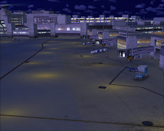
I am specially impressed by this view. High definition night textures.
All the gate lights at a glance.
This screenshot is amazing and, to me, shows all the tasks required in order to get this : ambient occlusion textures, bridges, custom traffic, custom buildings, etc.
The last set of screenshots have been taken during night time.
KMIA(MIA) airport completely modeled with significant attention to detailTexturing in HD mapping for all buildings and ground polygons
Shading and occlusion (texture baking) effects on terminal and other airport buildings
Custom reflection maps and customized global environment map (FSX)
Pond effect by which areas of the ground show as if there was a water pond only when it rains.
(FSX Surroundings extremely detailed, 8 square miles of customized buildings and objects (not autogen).
More than 30 square miles of photo scenery with hand placed autogen.
High resolution ground textures /
Custom runway texturesUpdated new terminal additions and other new airport buildings.
Static American Airlines parked at the maintenance aprons
Fully AI traffic compatibleCrosswind runways operations for both East and West configurations.
Excellent night effects.Optimized for excellent performance.
Inclusion of manual in PDF format.Birds (FSX)Native vehicle animations lines on many surrounding bridges and highways. (FSX)
Airdailyx, First Look July 09th 2013
by Dom Mason


10 comments:
I dunno if its worth buying. It looks very average to me.
All I can say is that if my FSX or P3D looked anywhere remotely similar to those screenshots, I would stop flight-simming.
I don't know what settings you guys use, but I find the above screenshots truly horrendous, especially in comparison with the clear and crisp screenshots that simmarket show for this exact same scenery:
http://secure.simmarket.com/latinvfr-miami-international-airport-kmia-v2.phtml
How to depict a newly available scenery in the worst possible way? Give it to AirDailyX and they will totally butcher it with their screenshots.
Come on guys, I'm sure you can do better than that! What the hell, those pics are just so bad.
Hey guys. Dom did his best. Mark is very busy with work and family these days and I am working on the latest Carenado and Twin Otter. Ill do my best to post some shots tonight. We know you guys are relying on us.
I'm surprised Latin VFR haven't asked you to remove these terrible screenshots. If anything, they will put any potential buyer off, and as stated above, the Simmarket screens show this scenery in a totally different light.
You shouldn't have to excuse these horrendous screenshots, come on, pull it together guys and replace them or remove them!
Thank god there are no overbright unrealistic night textures anymore. Good work
I don't get why AirDailyX have an obligation to show the addon in the best possible light? it's a first look, not an exclusive scoop or an infomercial.
In fact plain 'neutral' screenshots give prospective buyers a much better idea of what the addon actually look like compared to promotional screenshots. e.g. The Simmarket overview screenshots are zoomed out to give an illusion of depth, something which you may not see while flying in FSX.
Wow the screen shots aren't that bad. Give them a break
Dom's shots are fine. Go watch the official MIA V2 Video on simmarkit. It's very poor visually. It's the scenery guys, LatinVFR just arnt a top tier dev.
Post a Comment
Comments are now deactivated. Please visit our new website: AirDailyX.net
Note: Only a member of this blog may post a comment.