Bandwidth Warning: Lot's of eyeopening pictures inside.
Just a few days ago, Dzrewiecki Design brought us his latest masterpiece: Polish Airports Volume 3. As this package contains 3 airports, you can bet, i'll cover all three of these amazing sceneries over the coming weeks. But, this time, I just had to choose the airport in this package I admired the most. Thus, I am starting with EPWR.
Honestly, we love press copies and I love taking the time to give my impressions. It's my hope that I can give a direct intitutive insight into products I believe are worth a closer indepth impression than FS consumers would normally otherwise get from simply reading a discription on the SimMarket product page. It's also my hopes to expose products to simmers whom would not consider purchasing airport sceneries they have either never visited or may never visit. In this case, I was simply too impatient to wait for the press copy and purchased it. I was just too excited! I want to offer thanks to Stan for offering the product to us. I just wanted it too bad!! I am very happy and proud to have purchased it. Well worth it. Thanks again Stan!
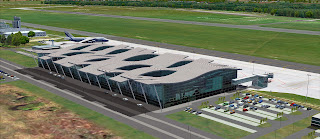
Now the simulation of the newly built terminal (just opened this year) is just as impressive as the actual airport itself. If there are 2 people whom I could shake hands with right now, it would be Jakub Paczek, Stanislaw, and the lead architect from JSK Architectural Group. People who made this work of art a reality. This honestly is truly a masterpiece!
I could almost frame these shots and hang them around the house. Don't think my wife would care for that too much though...
The photoreal textures honestly give an impression that you can see into or through the terminal. Very skillfully done. I can just imagine the team hangin out at the airport all day with their cameras taking thousands of pictures to get this just right.
One of just a very narrowed group of developers whom I feel gets it right when it comes to static aircraft. This fat Russian looks darn good sitting here on the ramp! He isn't going anywhere! The down side here is because the airport is so new, there is few AI flying into this beautiful airport. Believe me, i'm like Rainer Duda, I have every package from PAI and WOAI installed. Current and past packages and airlines that no longer exist. Still, the ramp looks empty. I am looking forward to more airlines flying here.
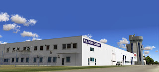
I really like the simulated rendtiton of the cargo complex. Those trucks look so good, I want to pull them out of my screen and roll them around on the carpet like my old Hot Wheels and MatchBox cars. These trucks look cool! I wish they were not static. One feature lacking in these projects are the animated vehicles. Too many sit and too few move. They are just too damn good looking to sit pretty.
Again, well done on the cargo complex! Highly detailed and realistic. Now one thing I mentioned about the EPKK scenery was regarding the control tower and firehouse. I really liked how the architecture maintained a modern look while retaining it's retro feel. Here, yet again, the team has accomplished the architects vision perfectly. I love the modern look of the new control and the retro feel of the fire house blended together.
Stylish! Lots of respect for the work here.
This blending of old and new just works so well here. The average person who will fly into or out of this airport may never take the time to notice and admire the work here. Nevertheless, the team made sure to get it right in this project so we, people who may not get to see this place... can.
Now wheras the new terminal may be what I consider to be the centerpiece of this airport, there is a lot more to see here. For such a small airport, there is much more to see! On to the old terminal... Which, I also like!!
Someone is advertising here!!
Viva la Wroclove!!
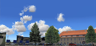
This next shot I did, I really liked! Very well done on the parking lot and the fence. With the trees and flags, it all just looks so good. Stan really has a level of passion he impliments into his work.
And from the other side...
And finally the old terminal. Which, honestly isn't really old at all. Just older than the centerpiece.
Again, the level of detail here is uncanny. I like!!
A close up of the old terminal.
These next few shots are just a few that I feel capture the environment that surrounds the scenery. I just love the way Stan expands outside the airport borders in order to give not just an accurate look and feel, the work is so detailed, so realistic!!
I honestly could tee off in the field in the below shot. Hole in one!
The security entrance to the old terminal area.
The realism here. Wunderbar!!
...and more of the surrounding environment.
The small town just outside the airport.
The Eastern European feel captured well in these buildings here.
Nice fencing!
Now before I end, I want to throw in some more shots of my favorite part of the scenery! Mind if I do?
Nice work! Well done on the glass!
Love the photoreal textures.
Well done! I could almost surf on those waves!! Quick! Someone get me a skateboard!!!
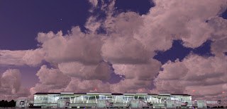
Now the only thing better than seeing this place during the day is seeing it at night! This baby is lit perfectly!!

Anther thing I really love about Drzewiecki's scenery are not regarding the airports at all. It's the custom made autogen. Far superior to the default autogen and has a modern look as well. Nicely done!! I want more of this! Perhaps
Dzrwiecki Design can sell an autogen package to replace all the boring default autogen in Europe.
As with all airports in my impressions, I have to be fair. Where there is so much good usually bound to be a little bad. So with this, I have to now state what Stan did wrong. Here we go.
..um. Huh. Well... Honestly, I couldn't find anything. I looked! I tried to find something wrong here. All I found was some missing textures on the passenger buses. I even thought, the area surrounding the airport was a bit void of scenery. But in real life, this airport really is in the boondocks out on the countryside. So if I can't find any problems with the scenery, then at least I can say what I may have done differently.
Perhaps, instead of doing photo-real textures on the main terminal, I would have taken the transparent approach. The only thing better than seeing the outside of this beautiful building would be seeing the inside as well. And i'm sure Dzrwiecki Design could do an amazing job creating and texturing the inside of this terminal. A similar building in a previous scenery would be EICK by Eiresim.
Now don't get me wrong. Terry of Eiresim is very talented and the quality of his work just keeps getting better and better with each release. But imagine Dzrwiecki Design taking on a project like this. The modeling and texturing of the terminal interior with his skill would likely be several times better.... Just my thoughts though.
In fact, it would look like this:
The only remaining things I would have done differently with the EPWR scenery would be to add the remaining buildings depicted in the photo-scenery while including AES lite for moving cars around the town and airport ramps. Other than that, get us the usual AES and i'm 100% happy with this work. A job well done Stan. 2 thumbs all the way up! Wonderful!
Stay tuned for my impressions of EPPO and EPBY coming soon! If you liked what you have seen here, and haven't purchased Polish Airports Vol. 3 yet, go get it!
Oh, and Mr. Paczek, you have set a major standard here. We are expecting more. MUCH more!
Thanks for reading!
Cheers!
D'Andre
((-D')) AirDailyX - we're on facebook! Join us!!


5 comments:
Wow, it look's really good i must say !
I might buy it next week :D
Aaaah... alors là oui ! Chapô ! It's great !!!
The author of this airport is Jakub Paczek - Drzewiecki Design was only a publisher here. :-)
I'll need Stan to confirm this before I edit the blog post.
((-D'))
I live in Wroclaw and I was a lot of times on this airport... Just beautiful!
Post a Comment
Comments are now deactivated. Please visit our new website: AirDailyX.net
Note: Only a member of this blog may post a comment.